
Conditions d’achèvement
Consulter
The SORMAS dashboard provides a comprehensive and visual representation of the current situation, aiding in effective outbreak monitoring and management. The dashboard has three views: Surveillance, Contacts and Samples.
Each dashboard summarizes data such as new cases, deaths, and test results, and includes graphs showing the number of cases over time, the Epidemiological Curve, and a map displaying case locations. The current dashboard selection will be dark blue with white font.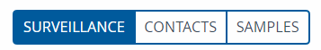
Brief Notes
Epidemiological dashboards are digital innovations for real-time visualisation of multiple streams of related data for purposes of surveillance and outbreak management. By these attributes, dashboards facilitate informed decision making using multiple combinations of indicators and figures obtained from data analyses. In this way, dashboards improve situational awareness – especially for ongoing outbreak responses. Aside from providing visuals for speedy situational assessment, epidemiological dashboards reduce information floods that may result from multiple sources of data, and minimise workflow interruptions – e.g. by having to manually perform periodic analyses of incoming data.
Surveillance Dashboard
The surveillance dashboard contains data relating to disease outbreaks. The Surveillance dashboard has two sections. The upper section displays summary information of case counts of each infectious disease for specified time interval of notification. This is accompanied by graphical display of the difference in number of cases between any two specified time intervals. The lower section displays an epidemiological curve, case status map and indicators for each disease; one at a time. The dashboard has filters for displaying information of specified diseases, times, and places.
Case status (on epi curve): This is used to group the cases by case classification (confirmed, probable, suspected, not yet classified).
Case status map: This is an interactive map that shows the spatial distribution of cases, contacts, events, and their related variables.
Epidemiological curve (epi curve): This a histogram of the number of cases of a specified disease by the date of illness onset. An epidemiological curve shows the progression and magnitude of the disease in the population.
Fatalities: The number of cases that died from the specified disease.
Grouping (on epi curve): This is the unit of time used to scale the horizontal axis of the epi curve. The possible options are: days, weeks, and months.
Last report district: The name of the district or local government area that reported the most recent case of a specified disease.
Map key: A legend of the map.
Map layers: This is an interactive function on the case status map that allows for the visualisation of cases, contacts, events, etc. by various characteristics of interest viz. case classification; reporting levels (facilities, regions, case counts, case incidence proportion), contacts, events, or any appropriate combinations of these variables.
New cases: The number of reported cases classified by case classification status (confirmed, probable, suspected, …).
New events: The numbers of events classified by event status (signal, events, screening, cluster).
Outbreak notification: Each epidemic prone disease has a predetermined number of case (outbreak threshold) beyond which an outbreak of the disease in question is said to occur. A red flag is automatically displayed on the tab of the disease in question when this outbreak threshold is exceeded. This outbreak notification is per disease, region and district.
Test results: The outcome of laboratory investigation of samples (positive, negative, pending, indeterminate).
Contacts Dashboard
The contact dashboard displays summary information of individuals reported to have come into contact with probable or confirmed cases of infectious diseases. The Contacts dashboard provides details about individuals contacted during the outbreak. The system also tracks missed calls and provides a visual representation of the progress made in checking on people. The contact map shows people in a specific area and allows for the display of contact information. Additionally, there is a disease network picture that shows infected people and their connections. For a selected disease of interest, the types of contact information displayed include: number of contacts, follow-up status chart and spatial distribution of contacts.
All contacts: The number of contacts classified by contact classification status (unconfirmed, confirmed, not a contact (discarded)).
Contact classification chart: A histogram of number of contacts grouped by contact classification status (confirmed, unconfirmed).
Contacts in quarantine: The number of contacts in quarantine.
Contacts per case: The minimum, maximum, and average number of contacts per case.
Data: The type of contact data depicted by the contact chart namely: follow-up status, contact classification, and date of end of follow-up (follow-up until).
Follow-up status chart: A histogram of number of contacts grouped by follow-up status (under follow-up, lost to follow-up, completed follow-up, cancelled follow-up).
Follow-up until chart: A histogram of number of contacts grouped by their last date of follow up.
Grouping (on chart): This is the unit of time used to scale the horizontal axis of the contact chart. The possible options are: days, epi-weeks, and months.
Stopped follow-up: The number of contacts which are no longer under follow-up for any of the following reasons: completed follow-up, cancelled follow-up, lost to follow-up, or converted to case.
Under follow-up: The number of contacts that are under monitoring (contact follow-up) by a contact tracing team. They are classified by their last visit remark (cooperative, uncooperative, unavailable).
Visits: The number of follow-up visits performed classified by visit remark (unavailable, uncooperative, cooperative).
Samples Dashboard
The Samples dashboard summarises lab results and status of samples that have been collected from contacts.
Keypoints
- The dashboard is a reporting tool to display a summary of all of the data collected in SORMAS
- The dashboard provides information about cases and contacts for a specific time by setting and applying a filter
- The graphs in the dashboard are interactive so you can hover your mouse over each part to see more information or group the data differently
- The map in the overview shows the location of cases and facilities and different layers can be chosen in the map
- The dashboard summarizes tasks as visits/calls in SORMAS, categorized by the person’s cooperation and availability.
Glossary of Key Terms
Open each section to see the definitions of key terms.
Modifié le: jeudi 25 septembre 2025, 08:47